
Join the Kiwis who are hatching their tomorrow and have invested more than $2 billion with Hatch.
If you've ever looked at a stock chart and thought it looked more like a heart rate monitor than an investment tool, you're not alone. Information can be helpful, but only if you know how to read it.
Basic price charts are great for showing where a stock's price has been, but they don't tell you much about what happened along the way. That's where candlestick charts come in. They can help you understand not just what happened to a stock's price, but how it got there.
Let's break down candlestick charts for beginners.
First up: What is a candlestick chart?
A candlestick chart is called that because it looks a little like a candle with two wicks. It shows more detail of a stock's movements than a simple line chart. Instead of just one price per time period, each candle shows four.
- Opening price
- Closing price
- Highest price
- Lowest price
It gives you more context about what happened during the trading period, revealing more of the story behind a stock's price movement.
Fun Fact: Candlestick charts were invented by Japanese rice trader Munehisa Honma in the 1700’s. This is why some candlestick patterns have Japanese names.
How do I read a candlestick chart?
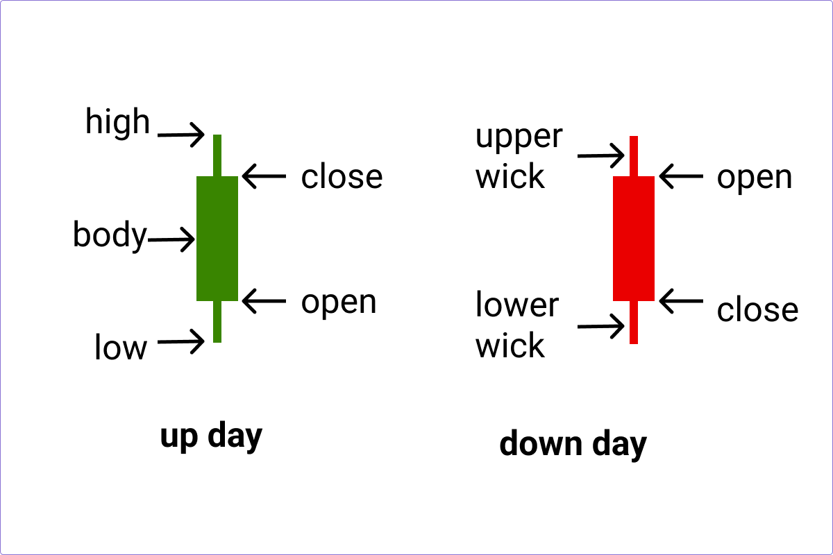
The body of the candle represents the difference between a stock's opening and closing price during a specific period. The thin lines above and below the body are called wicks (sometimes called shadows). They show the highest and lowest prices reached during that time period. Many platforms use red and green candles (but not all!), on Hatch:
🟢 Green candle (bullish): The stock closed higher than it opened.
🔴 Red candle (bearish): The stock closed lower than it opened.
Long bodies suggest stronger buying or selling activity, while short bodies can indicate indecision, or relatively little price movement.
What does one candlestick mean?
When looking at a candlestick chart, it’s important to know what time period you’re viewing. Each candle could represent minutes, hours, days, or even weeks depending on the time range you’re looking at. Let’s look at an example candlestick chart for one day price movements on Hatch.

With a one day view above, each candlestick represents a five minute increment. By clicking or tapping on the candle you’ll see the data behind the visual.
- 1d charts show five minute increments
- 5d charts show 30 minute increments
- 1m to 1y charts show one day increments
⚠️Important: Check what period you’re looking at on your chart, because this decides the meaning of each candlestick.
Reading candlestick chart patterns
Candlestick charts give a good visual on what a stock is doing, without having to immediately dig into the numbers. Remember that patterns in candlestick charts are seen as indicators, not guarantees.
Context matters. Looking at a single candlestick is a bit like reading one sentence from the middle of a book. To understand what it might mean, you need to look at the candles around it, combine that with some fundamental analysis, look at market conditions, and you'll start to see the bigger picture of what the share price has been doing. With that in mind, let's look at some common patterns and what they might indicate.
Candlestick charts are sometimes described as a battle between the bulls and the bears:
🐻 Bearish – Pessimism, expectation that prices will fall.
🐮 Bullish – Optimism, expectation that prices will rise.
Doji
The Doji candlestick has no body, so shows that the open and close prices are almost the same, suggesting that buyers and sellers were evenly matched during that trading period. Prices may have moved significantly up or down throughout the trading period, but neither side gained a clear advantage by the end. Because of this, Dojis are often viewed as a sign of indecision in the market.
There are a few different types of Doji:
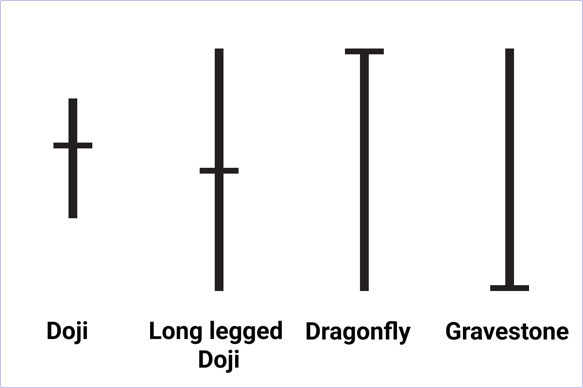
- Dragonfly Doji – has a long lower wick and little or no upper wick. This pattern shows that sellers pushed the price sharply lower during the trading period, but buyers drove it back to the opening price before the close. Some investors view this as a bullish sign, particularly after a downtrend.
- Gravestone Doji – has a long upper wick and little or no lower wick. It shows that buyers pushed the price higher during the trading period, but sellers managed to pull it back down by the close. Some investors interpret this as a bearish sign, especially after a prolonged uptrend.
- Long-Legged Doji– has long upper and lower wicks, showing significant price swings during the period despite ending near where it started. It can indicate heightened uncertainty.
Harami
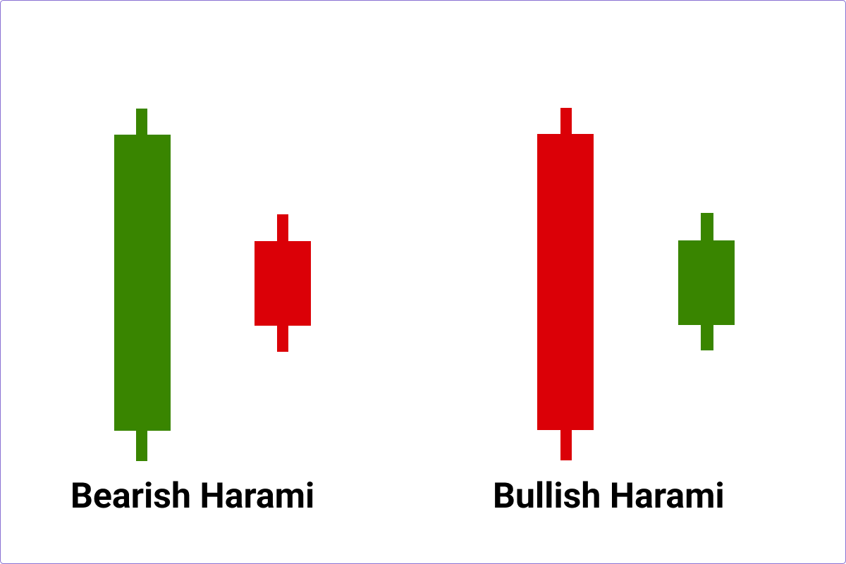
Harami is a two candlestick pattern where a large candle is followed by a smaller one, contained completely within the body of the larger candle. Harami means ‘pregnant’ so think: big candle (mum) → small candle inside it (baby). A Harami can suggest momentum is slowing, and that the existing trend (up, or down), may be weakening.
- Bullish Harami – Selling is weakening after a downtrend in stock price
- Bearish Harami – Buying is weakening after an uptrend in stock price
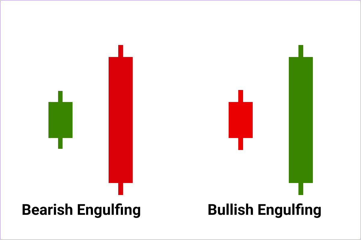
Engulfing
This is almost the reverse to a Harami - where a small candle is followed and completely engulfed by a larger candle. Where a Harami is momentum shrinking, engulfing is momentum strengthening in the opposite direction. An engulfing candle can indicate strong conviction, and a shift in momentum.
- Bullish Engulfing –A large green candle completely engulfs the previous red candle, possibly indicating stronger buying.
- Bearish Engulfing– A large red candle engulfs the previous green candle, potentially signalling stronger selling.
Hammer
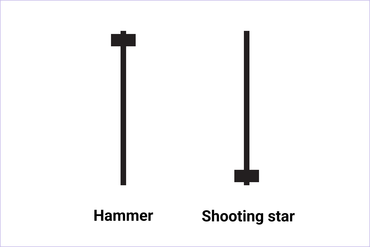
A hammer has a small body near the top of the candle and a long lower wick so it looks like a hammer (or a hangman). A Hammer might appear after a price decline and can suggest that sellers pushed the price down during the trading period, but buyers stepped in and drove it back up before the close. Some investors view this as a potential sign that downward momentum is weakening.
Shooting star
This candle pattern looks like a star falling from the sky. It has a long upper wick at least double the size of the candle’s body, little or no lower wick, and a small body near the low. It shows that buyers pushed the price significantly higher, but sellers drove it back down before close. This candle can suggest that a bullish trend is losing momentum.
These are just a handful of candlestick patterns. There are dozens more out there, including continuation patterns like Three White Soldiers, Three Black Crows, and Rising and Falling Three Methods if you're keen to go further down the chart-reading rabbit hole.
Limitations of candlestick charts
Candlestick charts can help investors visualise market activity, but they’re not crystal balls. Patterns don’t guarantee future price movements, and many different outcomes are possible depending on market conditions. Some investors use candlestick patterns a lot, while others place more emphasis on company fundamentals or broader market conditions. Investors who do use candlesticks often combine them with:
- Fundamental analysis & investing metrics
- Earnings announcements
- Volume analysis
- Share market news and market events
- Individual investing goals
- Personal risk tolerance
It's also important to consider trading volume. A candlestick pattern accompanied by high trading volume may attract more attention from investors than the same pattern occurring in a low-volume (or thinly traded) stock. Combined with volume charts, candlesticks can help provide a deeper picture of market activity. Both are available on Hatch.
The takeaway
Candlestick charts add another layer of detail to a standard price chart. Instead of simply showing where a stock's price ended up, they reveal what happened during the journey, like where the stock price opened, closed, peaked, and dipped along the way.
Whether you're a long-term investor wanting more context, or just chart-curious, understanding candlesticks can help you make more sense of the daily ups and downs of the market. Use them alongside doing your own research and analysis, keep your long-term goals in mind, and try not to get too distracted by the market's daily plot twists.
Candlestick chart FAQs
What does a red candlestick mean?
If a candlestick is red it generally means a stock closed lower than it opened during that trading period. It's also called a bearish candle. It shows that sellers had more influence than buyers during that specific period.
What does a green candlestick mean?
A green candlestick means a stock’s price closed higher than it opened during the trading period.
It’s often called a bullish candle. One green candle, or even several green candles, doesn’t mean a stock’s price will keep rising, it just shows that buyers were in control during that specific period.
What do the lines (wicks) at the top and bottom mean?
The lines above and below the candle body are called wicks (or shadows).The top wick shows the highest price reached during that trading period and bottom wick shows the lowest price. Long wicks can be a sign of price volatility, a sort of tug-of-war between buyers and sellers.
Can candlestick charts predict share prices?
No. Candlestick charts can help investors spot patterns, trends, and shifts in market sentiment, but they can't predict future share prices with certainty. Markets are influenced by lots of things, including company performance, economic conditions, and investor behaviour, so candlestick charts are best used as one tool among many when researching investments.
Are candlestick charts better than line charts?
Not better, just different. Line charts are simple and great for getting a quick view of a stock's overall performance over time. Candlestick charts give you more detail, showing the opening, closing, highest, and lowest prices during each trading period. If you want a quick snapshot, a line chart may do the job. If you want more context about how a stock moved during the day, candlestick charts can be useful.
What is the difference between a bullish and bearish candlestick?
A bullish candlestick usually indicates upward price movement during a trading period and is green, while a bearish candlestick indicates downward price movement and is red. Bullish doesn't guarantee future gains, and bearish doesn't guarantee future losses. These terms just describe the price movement that happened during that specific candle.
What time period does a candlestick represent?
That depends on the timeframe you're viewing. A single candlestick could represent five minutes, 30 minutes, a day, a week, or even a month. Always check the chart timeframe first, because it changes what each candle is telling you.
Read more: How to use candlestick charts on Hatch

We’re not financial advisors and Hatch news is for your information only. However dazzling our writing, none of it is a recommendation to invest in any of the companies or funds mentioned. If you want support before making any investment decisions, consider seeking financial advice from a licensed provider. We’ve done our best to ensure all information is current when we pushed ‘publish’ on this article. And of course, with investing, your money isn’t guaranteed to grow and there’s always a risk you might lose money.







.png)